Generative AI is all the rage these days.
I’m sure you’ve been subjected to endless marketing emails and upsell prompts to try out exciting new generative AI features. (Even as I draft this blog post in Notion, the tooltips prompt me to “Ask AI").
One of the more prominent upsells I have seen is Google’s Bard promotion in search results.

Without a doubt, these (and other) upsells are being run as experiments: Taking up prime real estate on a Google search results page is sure to trade off with ad revenue, time spent, and “meaningful interactions.”
I’ve seen this before.
When Instagram launched Stories, they were betting on dedicating some of the most valuable pixels in the world to a new feature that had no monetization. Time spent in stories traded off directly with time spent consuming feed posts, where Instagram did make money from feed ads.
I have no doubt there was an experiment measuring the impact of the new top-of-feed unit. I also am confident that the experiment showed a decrease in revenue, and yet the strategic product tradeoff of ceding the stories space to Snapchat was not worth it.
These sorts of changes always come with certain short-term tradeoffs, and measuring the magnitude of the impact on key metrics makes it easier to decide which way to go. They may have even decided on a specific budget (as represented by the reduction in ad revenue) for the new feature, and could have turned it off had it exceeded that threshold.
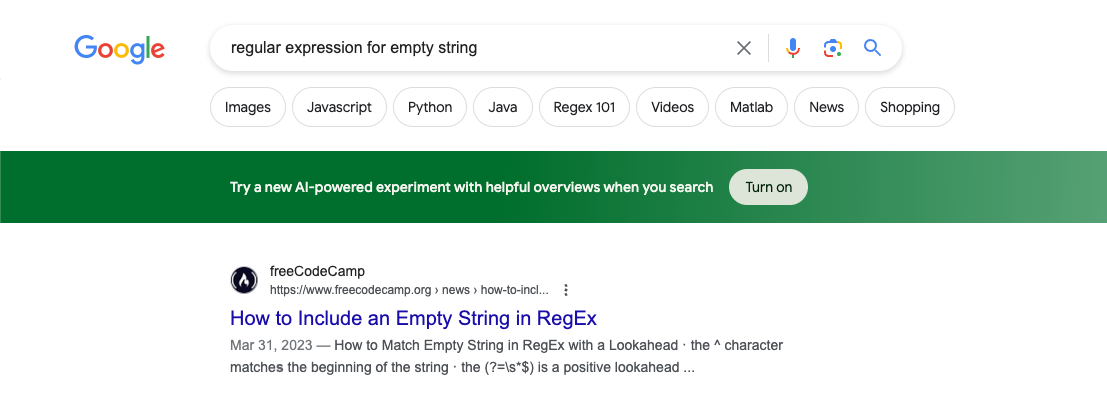
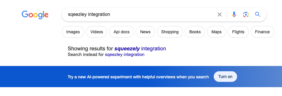
Now let's turn back to what Google has been up to. Inside of Google search, Google has been promoting its new AI search feature with the upsell above. But I’ve been exposed to a few different variants of this upsell over the past few months (and made sure to screenshot it each time 😈). At the risk of embarrassing myself by exposing my searches, here they are:


It seems the unit has mostly stayed the same: Google seems to have decided the top of the search results is the best placement for this unit, but wants to experiment with different colors. It's almost comical how parallel this example is to a stereotypical "Green button vs Red Button” A/B test example—yet here it is, out in the wild in an active experiment by one of the largest technology companies.
Get a free account

Google's AI upsell experiment
I’d love to know a bit more about their experiment setup.
Typically, you wouldn’t want someone to know they are in an experiment, and yet this clearly tipped me off—especially because I was exposed to multiple versions of the experiment. Or was it multiple variants of the same experiment? (I took these screenshots over a period of a few weeks, so I assume it was multiple different experiments.)
How did they decide which searches received which color? Was it randomly assigned per search query?
If it were a single experiment, that might explain why sometimes I got the green banner, other times I got a blue banner, and still others I got a red banner. Or was it assigning an experiment group based on the user logged in to their Google account? That would likely make it easier to tie metrics back to the downstream impact of this banner on the usage of Bard and search alike.
I wonder if they even had a metric based on search queries for competitive products like ChatGPT, or even usage of ChatGPT from users logged into their Google accounts on Chrome. Could they determine if I stopped using a competing product as a result of seeing one of these green or blue banners?
These sorts of questions help you set up and measure new features, and it's fun to guess what Google or another company is measuring when they launch a new feature. I only wish we could see the experiment results for this, and the set of metrics Google is monitoring along the way.
Statsig helps with this
At Statsig, we often advise companies on setting up different experiments like this one. We offer powerful tools that give you the same level of control and measurement over your feature launches as the engineers at companies like Google and Instagram. Turn off your next buggy release in seconds, or prove the value of your next big feature with data to back it up, all within Statsig.
Get started now!
